As you can see from the post you’re reading right now, it looks a bit different to what you might remember!
I was opting for a more … open design allowing for more negative space and I think the design now looks pretty good. Lots of space between the different elements, clean and sharp look and I find the writing itself easy to read.
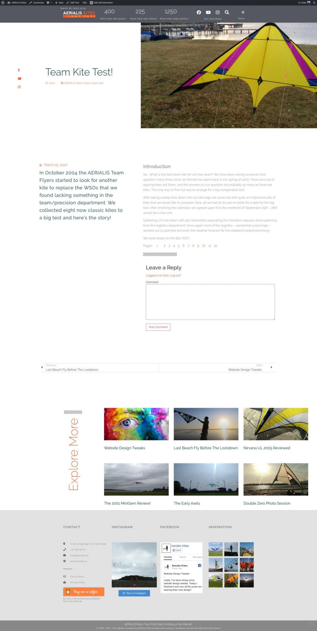
Off course the design is looking good on a tablet and your phone. Totally responsive!
I really hope you like the refreshed look too and feel free to comment in the comments field below!
Stay safe! 🙂